TYPEFACE DESIGN
TYPEFACE DESIGN
ILLUSTRATOR, RIBBON & PINS
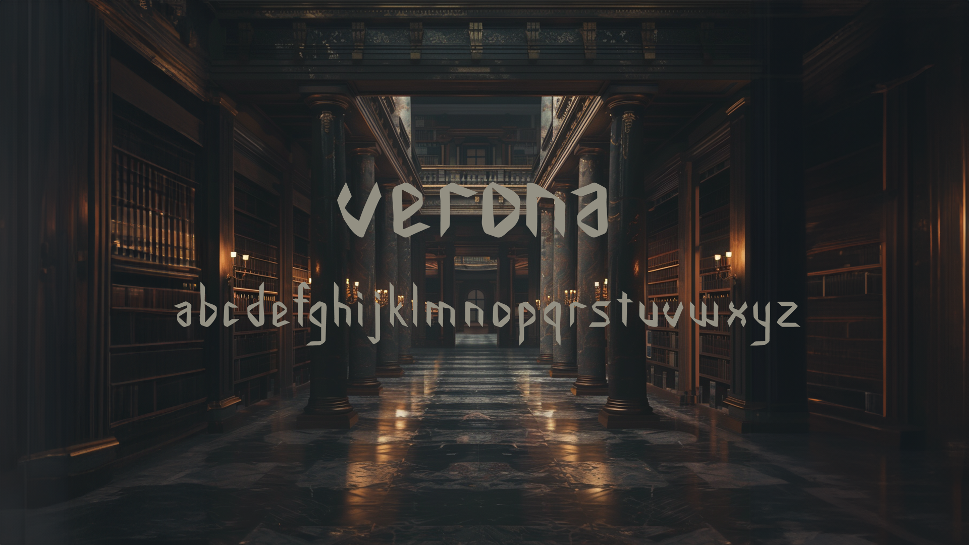
VERONA TYPEFACE
Verona is a modern Blackletter typeface designed using ribbon and pins to form the basic shapes and angles and refinedand further developed in illustrator
PROCESS
ribbon and pins


The focus was on 8 letters to start with before expansion. The ribbon was cut and shaped into letters and held in place using pins. The letters were then brought into photoshop to remove the background and turned into black and white. Using image trace in Illustrator the shapes were turned into vectors and specific shapes were chosen to repeat throughout the letters. The letters were then further refined by using the smooth tool and modulating stroke withs. Once counter shapes and angles and terminals were decided the letters were then expanded to form the full alphabet.
FINAL TYPE DESIGN
The outcome of the process is a Blackletter typeface. Shaping the letters with ribbon introduced organic curves and fluidity. The pins used to anchor the ribbons creates sharp contrasts with the soft curve.
The design was refined in Adobe Illustrator to
help sharpen and define the details, ensuring
the typeface retains the classic high contrast and vertical emphasis of blackletter typography while smoothing out the inconsistencies.

APPLICATIONS

wine label front
wine label back
This typeface features bold, black characters that contrast sharply against the wine label's background, ensuring that the brand name stands out prominently. This typeface is particularly suited to luxury and sophisticated brands due to the artistic and refined characteristics in the folds and angles.
The design elements of the typeface, sharp angles and unique folds are particularly noteworthy with the letters "a" and "m," which exhibit unique folds at the corners and elegant curves.

Here the verona typeface is used to redesign the book “The Metamorphosis” by Franz Kafka. I added a glitch effect in the typography to deepen the connection with the book's themes of transformation and instability. The effect — characterized by jagged, interrupted lines — visually represents the protagonist's disorienting experience of becoming something entirely different from his former self.
book cover
This design choice mirrors the book's exploration of identity, alienation, and the jarring nature of sudden, inexplicable change. The fragmented and distorted text invites readers into the protagonist's fractured reality, setting the tone for the psychological and physical metamorphoses that unfold within the narrative including the breakdown of communication and understanding between Gregor and his family, reflecting the deeper existential and alienating themes of the novel.
